Responsive Editing in Elementor
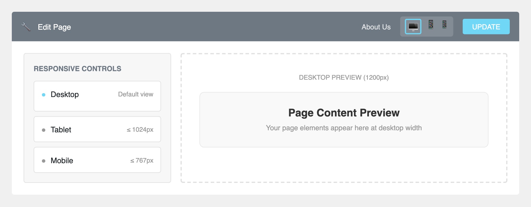
In the Elementor editor toolbar at the top centre, you’ll see three device icons: Desktop, Tablet, and Mobile. Click the Tablet or Mobile icon to see how your page will look on that device. The canvas will resize to simulate the screen width. You can also click the responsive icon at the bottom of the widget panel.
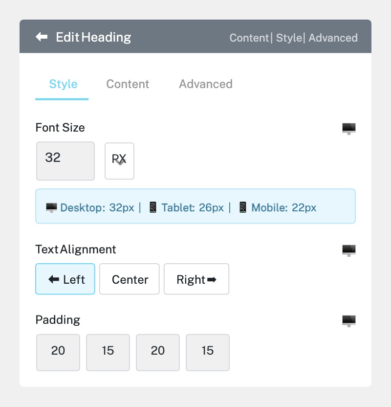
Many Elementor settings can be set differently for each device. Look for a small device icon next to settings like font size, padding, margin, and column width. When you see this icon, it means you can set a different value for desktop, tablet, and mobile independently.
For example, a heading that’s 48px on desktop might be too large on mobile. Switch to Mobile view, then reduce the font size to 28px — this change will only apply to mobile devices.
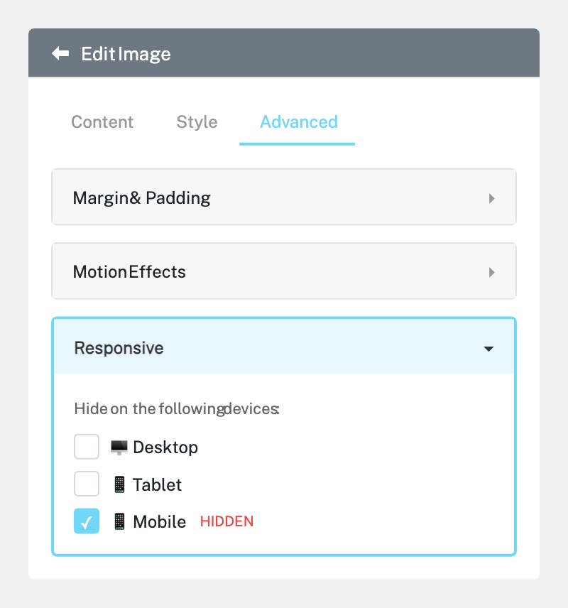
Sometimes an element looks great on desktop but doesn’t work on mobile. You can hide it:
1. Select the widget or section you want to hide.
2. Go to the Advanced tab in the left panel.
3. Scroll down to Responsive.
4. Toggle Hide on Mobile, Hide on Tablet, or Hide on Desktop as needed.
Hidden elements will appear with a striped overlay in the editor but won’t show to visitors on that device.
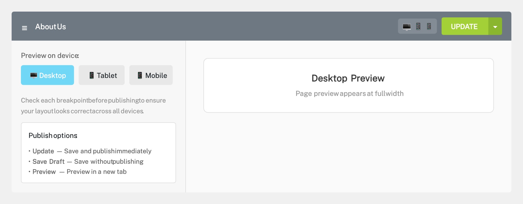
After making responsive adjustments, cycle through all three device views (Desktop, Tablet, Mobile) to check everything looks correct. Use the Preview button (eye icon) to open the page in a new browser tab, then resize your browser window or use your browser’s developer tools to test different screen sizes. When satisfied, click Update to publish your changes.
Completed
If you are still experiencing issues, our support team is here to help.
Was this article helpful?